
Foodilingo Case Study
Project Background
Foodilingo is a robust application that allows the users to order food or find nearby food stores, particularly during natural calamities, ensuring seamless access to food and essential services in times of crisis.
Target User
People who are displaced due to disasters in urban and suburban areas.
My Role
UX designer designing an application for Foodilingo from conception to the design of the final product.
Responsibilities
Conducting interviews, paper and digital wireframing, low and high-fidelity prototyping, conducting usability studies, accounting for accessibility, and iterating on designs.
Understanding the users (Empathize)
Empathy Map
After conducting user interviews, created an empathy map of what the user says, thinks, does and feels.
The empathy map shown on the right is based on the entire user group that are in need of an interface to access food during the time of a disaster.

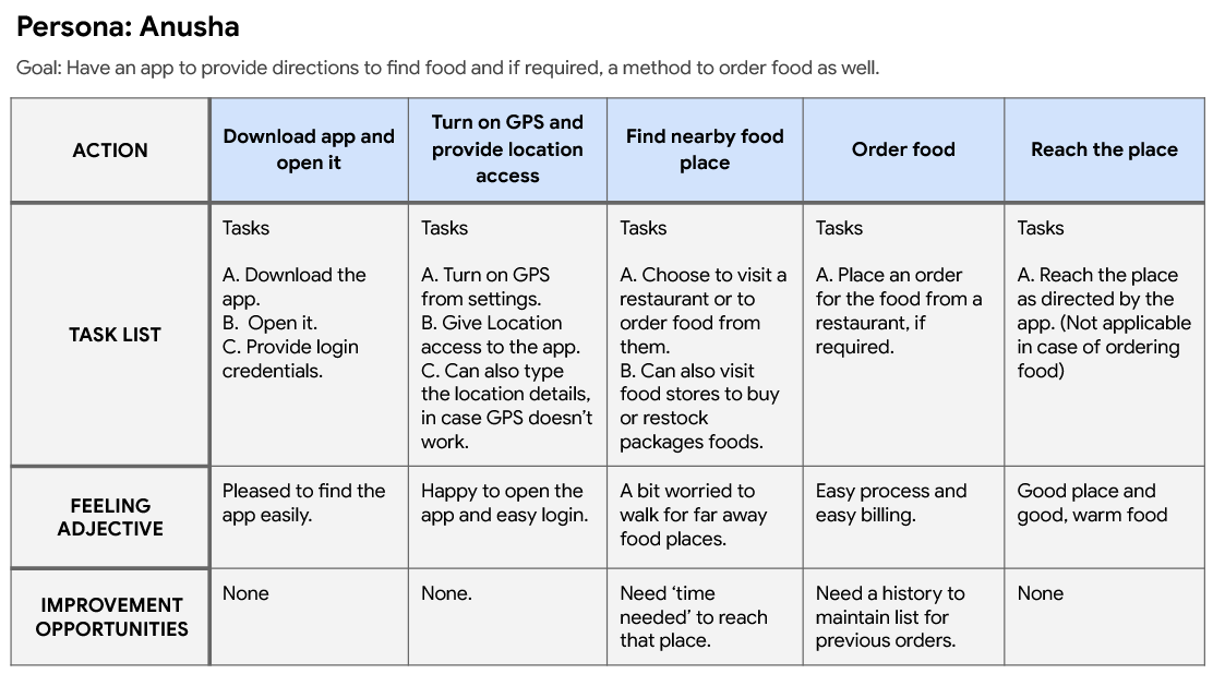
User Story
I created user persona that denotes the entire user group. The persona Anusha is a program manager at an MNC in Balasore, India.
I also added the goals and frustrations of the persona to highlight on the pain points and the expectations. On the basis of the persona and empathy map, a user story was created.
“As a woman living in the cyclone prone area (type of user), I want to find food through a software (action), so that I can have my food as soon as possible when relocated to a new place after warning (benefit).”
User Journey Map
I created a user journey map to visually represent the actions of a user, in order to achieve a goal.
Defining the problem
Who has the problem?
Anusha is a Program Manager at a big MNC and she lives near Balasore, Odisha, India. This place is located near coastal area which is very prone to cyclones.
What is the problem?
Due to frequent onset of disasters in her city, she is compelled to relocate to a temporary shelter after the warning. She is completely new to the place and has no idea how to arrange for food. She needs a tool to find places where she can eat or buy food items.
Why would Anusha want to use Foodilingo?
Let’s see from overall perspective. Anusha simply wants to use a tool to find food around herself in the disaster struck area. So, there is a need of a map. Using the map, she can visit the restaurant/ food store and her goal is achieved. But there is also a possibility where she is unable to visit the place and might prefer to order the food at her location. According to a survey, 81% Indian consumers order food through delivery apps due to convenience. So, Foodilingo offers an interface where a person can see the map and also order the food from the same platform. There is no need to have separate applications for navigation and ordering food.
Finding Solutions (Ideate)
Pain Point 1
Users struggle to quickly locate nearby restaurants or food outlets, particularly in unfamiliar areas or during emergencies.
Pain Point 2
They are unable to seamlessly navigate to their desired food destinations due to the absence of map-based guidance within existing solutions.
Pain Point 3
They find it inconvenient to download and switch between multiple apps for food ordering and location services.
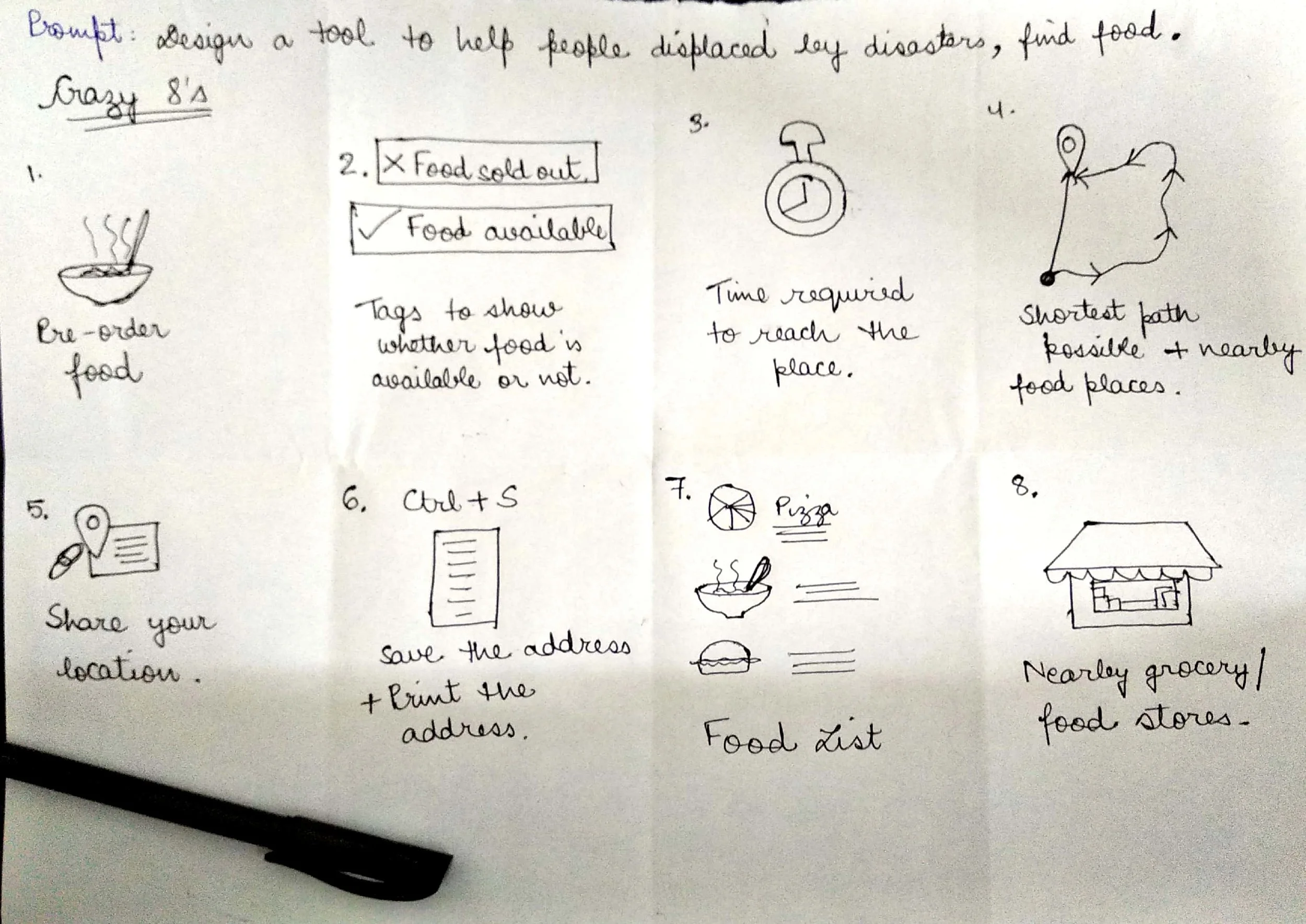
Crazy 8’s
Crazy 8’s is an intense brainstorming exercise where I generated 8 distinct ideas within an 8-minute time frame.
During this session, I explored and outlined all potential features that could be integrated into the application.
It helps me think creatively to ensure a comprehensive set of solutions.
Prototyping (Low-Fidelity)
Paper Wireframes
After consolidating the data from the use stories and journeys, I created paper wireframes for mobile application.
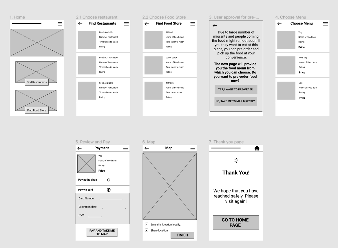
Digital Wireframe and Low Fidelity Prototype
After the creation of paper prototype, a digital wireframe was created. This digital wireframe gives an overall navigation structure and functionality of the application. The low-fidelity wireframe was used to understand the user’s journey and after the usability testing and reviews, high fidelity mockups were created.
Usability Study Parameters
Study Type: Unmoderated Usability Study
Location: India, remote
Participants: 5
Length: 15-20 minutes

Usability Study Findings
People need to know more details about the food. Especially the ingrediants to check for allergic reactions.
People need to order multiple food items at once. Cart system should be provided.
Need a confirmation whether the payment was successful or not.
Need to know the number of servings per plate.
Prototyping (High-Fidelity)
App High Fidelity Prototype
Provided a search bar in case the list gets too long.
Provided an option to add filters as well where user can filter out the items according to their wish.
Each card displays no. of servings of the food, rating of the food item, name, type (veg or non-veg), calories count, price and a ‘+’ icon to directly add the item to the cart.
View High Fidelity Prototype

Accessibility Considerations
Used simple colors for all pages, checked from WebAIM checker.
Made sure that the screen readers are able to understand the hierarchy of elements as most of them are horizontal.
Only added useful information on the screens, avoiding information overload.
Takeaways
What I Learnt
Usability study is a continuous, evolving process. I am still uncovering and addressing user pain points as I gather more insights. Through what I've learned so far, I've developed a deeper understanding of how to engage with users, empathize with their challenges, and deliver solutions that not only meet their needs but often exceed their expectations.
Next Steps
The application could incorporate audio guidance within the map feature, allowing users to navigate without needing to look at the screen, particularly useful while driving or in situations where the screen may be inaccessible or difficult to view.
This enhancement would improve safety and convenience by providing hands-free, auditory directions.