
Order-to-Cash: Cash Application
The Problem
Handling Exceptions when the system cannot automatically match a payment to an invoice and requires manual intervention or further investigation.
The Product
Cash application helps in the process of managing and applying incoming customer payments to the correct invoices or accounts in a company's financial system. It ensures that payments are properly recorded and matched with outstanding invoices, ultimately helping the business maintain accurate financial records.
Team & Role
Role: Sole UX Designer (Responsible for end-to-end UX design from scratch, from research and wireframes to final UI and stakeholder alignment.)
Team: Product Manager, UI Architect, Developers, QA
Duration: 3 months (December 2023 to March 2024)
Process and Challenges
Research
Challenges
User Persona
Information Architecture
Organization
Hierarchy
Sequence
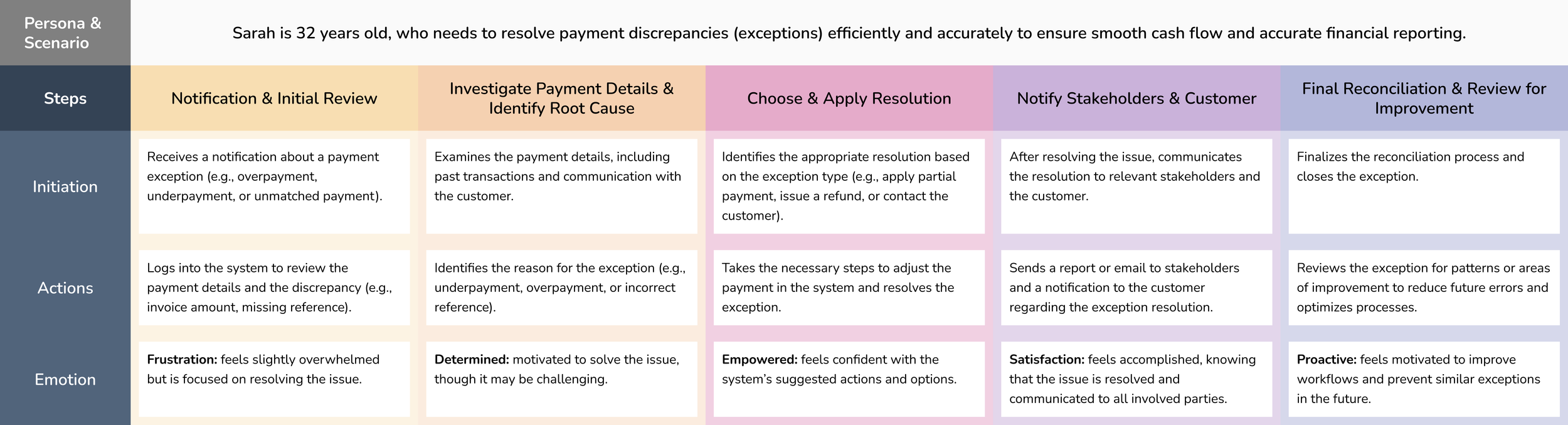
User Journey Map
Steps
Initiation
Action
Visual Design
Wireframes
High Fidelity Prototypes
3 Possible Exception Handling Challenges
Customer details like name or number has not been identified or there is no matching criteria in the received payment information.
If a payment is received without sufficient invoice information, the system cannot determine which invoice it applies to, raising an exception.
When a payment is received that doesn’t match an existing invoice, the system flags it as an exception.
Plan of Action
1. Understanding User Persona
The first step was to understand ‘who’ would be using our products.
Collaborated with Product Management to profile the Accounts Receivable Specialist, then mapped their exception workflows to identify friction points
The Accounts Receivable Specialists are the major users of Cash Applications in the Order-to-Cash cycle.
Their main goal was to streamline the matching of incoming payments and customer invoices.

2. Building User Journey
The second step was to understand ‘how’ would our users interact with our products.
By analyzing the daily tasks and workflows, I developed a comprehensive user journey that outlines how to effectively manage and resolve exceptions.
3. Formulating Information Architecture
Discussing with the UI Architect, I built an Information Architecture to optimize the user’s navigation experience, ensuring they can quickly and efficiently move through menus.
The product was divided into 2 menus: ‘Exceptions’ and ‘All Payments’.
The first menu: Exceptions displays a detailed list of all exceptions that require review by the A/R Specialist, ensuring efficient identification and resolution of any discrepancies.
The second menu: All Payments section contains a comprehensive list of every payment, irrespective of their exception status, providing a holistic view of the entire payment flow and enabling effective tracking of all transactions.
We initially developed a Design Kit supporting both Light and Dark themes. However, after discussions with the development and architecture teams, I decided to proceed with the Dark Theme. This decision was driven by the quicker availability of the ReactJS environment and its associated features, ensuring alignment with the project's delivery timeline.

Steps and Key Features
1.) Landing on the Exception Listing Screen:

Upon logging in, the user is directed to the exception listing screen, where they can easily view a comprehensive list of payments flagged with exceptions.
Fig. 1: I chose to present the summary as an accordion to maximize the available height for the List section below. This layout allows financial analysts to view the list more comfortably and efficiently. Additionally, each link within the accordion functions as a filter for the grid displayed beneath, enabling quick and targeted data access.
In the detailed view, the left panel presents a clear breakdown of the customer’s information.
2.) Viewing Payment and Exception Details:

Fig. 2: I chose to divide the page into two sections: a left panel and a right section that displays the errors step by step.
The left panel shows the customer information related to the exception and remains static, regardless of the exception stage. The right section displays the detailed, step-by-step flow of the raised exception along with the suggested actions at each step.
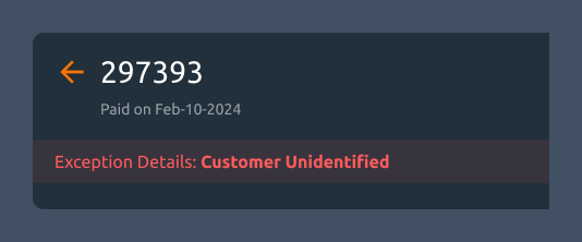
To direct the user's focus towards the key exceptions, I introduced a prominent banner that highlights the exception type.
3.) Banner:
Fig. 3: The color of the banner reflects the severity of the exception case. High-severity issues, such as those occurring at the initial stages and impacting subsequent processes (e.g., an unidentified customer), are highlighted in red. Medium and low-severity exceptions are indicated with distinct colors to visually differentiate their urgency. This visual cue is designed to immediately draw the user’s attention to the left panel, where the specific details and descriptions of the errors are displayed.
Two secondary actions are made available to the user: Ignore Exception or Mark as Corrected. These options allow the user to either dismiss the exception if it's deemed irrelevant or resolve it directly within the system.
4.) Secondary Actions – Resolution Options:

Fig. 4: I kept these buttons as secondary actions because they are not directly related to the main issue the user came to resolve. They are only used when the exception was raised by mistake or when the user chooses to ignore the exception and move forward.
The status indicates the user's progress, ensuring they know which actions to complete at each stage before proceeding.
5.) Status:
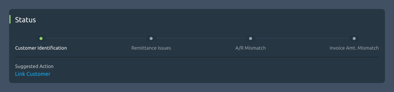
Fig. 5: I added a wizard component to give users a clear and intuitive view of their progress. Each step includes a suggested action, which opens as an overlay or popup for easier interaction. These actions, dynamically suggested based on the specific exception type, guide the user towards the most appropriate solution.
6.) Step Details:
This structured layout allows users to identify the required actions. This is just a view-only section that contains technical information of the each raised exception. It changes dynamically as per each step in the wizard component above.

Fig. 6: All the components used here: toggle buttons, grid and grid action buttons (tertiary buttons) are from our pre-defined UI Kit.
Quick Video:
Takeaways
Impact
Following extensive usability testing and multiple design iterations, the product was met with a highly positive response from customers, achieving an impressive 32% conversion rate to this new product.
Customers expressed a clear preference for this updated design, citing its enhanced structure and efficiency in resolving conflicts and exceptions within the payment cycle.
What I Learnt
I learned the importance of creating scalable designs that can adapt to future use cases. By thoughtfully considering potential growth and changes up front, I can avoid costly and time-consuming design modifications later on.
Developing scalable components is not only crucial for maintaining flexibility but also for optimizing long-term business efficiency and minimizing development costs.